Monday, July 16, 2012

WALKING IN THE FUTURE REDUX


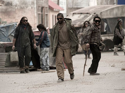
And speaking of walking in the future, as I was a few posts back, a reader pointed me in the direction of the movie The Book of Eli.  It was a movie I’d never really fancied, partly because it sounded a bit “spiritual” (which in fact it is) and because Denzel Washington, as Eli, looked so gosh darned noble in all the stills, (although of course I do know that Denzel has a lot of trouble NOT looking noble, whatever part he’s playing).


 But now I’ve seen it and I’m glad I did.  The movie is set in a future so bright that everybody has to wear shades whenever they step outside, because “the war tore a hole in the sky”.  This of course makes everybody look very cool, or very cool and noble in Denzel’s case.


And yes indeed, as ever, there is plenty of futuristic, over-dressed walking.  Eli has been walking west across America for 30 years, and when somebody asks, "How do you know you're walking the right way?" he replies "Faith."

If you’re especially alert to spoilers, this may tell you pretty early on that Eli is in fact blind, so presumably he doesn’t actually need the shades, and the blindness certainly doesn’t inhibit his fighting skills, though it may explain why it’s taken him so long to walk across America.  If you ask me, having blindness as a movie’s major plot twist is a bit of cheat, but I know some people think it’s a brilliant device.


Anyway, the walking gets a good deal more decorative when Eli has Mila Kunis as a fellow traveler.  And the movie kicks up to a whole other level whenever Gary Oldman appears on screen, playing Carnegie, a scenery-chewing villain and (as it happens) crazed bibliophile.  I think we've all been there and done that.


Now frankly I’d be happy to watch Gary Oldman chew scenery from now till the Rapture, and although he doesn’t do much walking in the movie, he looks very cool indeed on the occasions when he does.  In fact Gary Oldman looks very cool indeed, pretty much all the time.  Just how many people could get away with walking down a fashion runway dressed like this? And it's not even in the future.  


Tuesday, July 10, 2012

WALKING THE SUBLIME


Because a little John Ruskin goes a long way, I included only a short quotation from him about Turner in my last blog post.  Now I realize I might have quoted a little more, for reasons that I think will become obvious.

The longer quotation runs as follows:  “he (Turner) has admitted into his work the modern feeling of the picturesque, which, so far as it consists in a delight in ruin, is perhaps the most suspicious and questionable of all the characters distinctively belonging to our temper, and art. 
     “It is especially so, because it never appears, even in the slightest measure, until the days of the decline of art in the seventeenth century.  The love of neatness and precision, as opposed to all disorder, maintains itself down to Raphael's childhood without the slightest interference of any other feeling; and it is not until Claude's time, and owing in great part to his influence, that the new feeling distinctly establishes itself.”


Well, are we sure about this?  The Claude in question is, of course, Claude Lorrain, originally Claude GellĂ©e, a French Baroque painter, c 1600 to 1682, one of those artists that it’s very difficult for a modern sensibility to embrace.  His well-ordered, idealized, “noble” landscapes, often bathed in a golden glow with a few “picturesquely” placed peasants seem, regardless of what Ruskin says, rather too neat and precise.  To a modern eye, at least mine, the presence of ruins actually comes as a welcome element of appealing disorder.


But I assume Claude himself would have felt that way at all.  He lived most of his productive life in Rome and was, according to the biographies, a great walker around Rome and its hills.  Then, as now, the people of Rome walked, and went about their daily lives, surrounded by ruins.


Julian Bell in the London Review of Books, reviewing an exhibition of Claude’s work at the Ashmolean in 2011 writes, “Claude would walk out of town and along the Tiber. The drawings in the show include discoveries made by pen and brush while looking at riverbanks, farmsteads, ruins and trees. They have a happy urgency, driven by a longing to memorise fleeting tonal relations so that, back in the studio, an invented arrangement of planes could be modulated until it looked like a scene observed.”  By which I think he means that Claude walked out, looked around him, liked what he saw, but thought he could improve on it.  He’d have loved Photoshop.  OK, hold that thought.


Recently I’ve been enjoying a website titled BLDGBLOG run by Geoff Manaugh, a writer and editor who sometimes seems to be described as a “futurist.” The website professes to be concerned with “Architectural Conjecture: Urban Speculation: Landscape Futures,” but it’s a lot more fun than that might sound.  There’s a book too, titled The Bldg Blog Book, which I have bought for cash money.  The website is here:


Manaugh isn’t engaged with walking per se, but when people talk about the future and reconfiguration of cities it’s a topic that tends to come up.  There’s a laceratingly hilarious piece on the blog when he goes to an event discussing “great streets” and becomes increasingly enraged “because the moderator turned the whole thing into a kind of ‘what's your favorite street in LA?’ quiz.”  And having ventilated mightily on his own website he admits, “Not that I chimed in; lamely, I left the minute it ended and walked home to eat some dinner.”  A man after my own heart.


Anyway, on the blog and in the book there’s an interview with Simon Norfolk, who is a war photographer, though hardly in the tradition of Robert Capa or Don McCullin. He’s concerned, at least in part, with the aftermath of war, in ruined landscapes, blasted infrastructures, and more or less destroyed buildings, and he does manage to find some gorgeous, if obviously problematic, beauty in these subjects.  He says he’s concerned with “the military sublime.”


Part of the interview runs as follows:

BLDGBLOG: Your photos are usually unpopulated. Is that a conscious artistic choice, or do you just happen to be photographing these places when there's no one around?

Norfolk: Well, part of this interest of mine in the sublime means that a lot of the artistic ideas that I'm drawing on partly come out of the photography of ruins. When I was in Afghanistan photographing these places – photographing these ruins – I started looking at some of the very earliest photojournalists, and they were ruin photographers: Matthew Brady's pictures of battlefields at Gettysburg, or Roger Fenton's pictures from the Crimea. And there are no dead bodies. Well, there are dead bodies, but that’s very controversial – the corpses were arranged, etc.
     "But a lot of those photographers were, in turn, drawing upon ideas from 17th century and 18th century French landscape painting – European landscape painting. Claude Lorraine. Nicolas Poussin. Ruins have a very particular meaning in those pictures. They're about the folly of human existence; they're about the foolishness of empire. Those ruins of Claude Lorraine: it's a collapsed Roman temple, and what he's saying is that the greatest empires that were ever built – the empire of Rome, the Catholic church – these things have fallen down to earth. They all fall into ivy eventually.
     "So all the empires they could see being built in their own lifetimes – the British empire, the French empire, the Dutch empire – they were saying: look, all of this is crap. None of this is really permanent: all of these things rise and fall. All empires rise and fall and, in the long run, all of this is bullshit."


 Well, I don’t know if Claude would have put it quite like that.  And John Constable certainly wouldn’t, and didn’t.  He said that in Claude’s landscapes "all is lovely – all amiable – all is amenity and repose; the calm sunshine of the heart." Because I tend to share Norfolk’s sensibility, I agree it would be really nice to think that even as Claude was selling idealized landscapes to rich clients, and making himself rich in the process, he was an anti-Imperialist avant la lettre, but I’m not sure he really was.


Manaugh asks Norfolk why there are so few people in his photographs and he replies,  “I think people kind of gobble up the photograph. They become what the photograph is.”   I understand his point but I think he protests a little too much: some of his pictures do indeed include people, and they’re often the ones I like best.  And the fact is I like Simon Norfolk's work very much indeed.

Claude apparently had no such agonies about including people in his images. His landscapes are usually populated to a greater or lesser degree.  Sometimes the people are just another compositional element but by no means always, as in The Walk to Emmaus.  That’s Jesus walking in the middle.


Simon Norfolk, in a different interview that can be found on his website, does however, say something about walking that I absolutely treasure, "Walking a Kabul street can be like walking through a Museum
 of the Archaeology of War - different moments of destruction lie like sediment on top of each other."  I wonder if Claude would have even known what he was talking about.  I hope so.

Simon Norfolk’s website is here:


Tuesday, July 3, 2012

LINES WRITTEN A GREAT MANY MILES FROM TINTERN ABBEY


The idea behind walking through LA’s downtown adjacent to the SCI Arc building was to look at some interesting post-industrial desolation before it gets gentrified out of all existence.  And in fact it’s probably too late already.  The transformation process is well advanced: factories are being turned into luxury lofts, coffee roasters are springing up like mushrooms.  The area is actually referred to on certain street signs as the Art District, and I like art well enough, but designating an area of the city as “arty” seems somehow incredibly dodgy.


Sure, there’s some spectacularly good street art around, including the piece above, but there is something a little schooled about most of it, not that I necessarily yearn for ugly, unschooled street art.


Be that as it may, between the pockets of gentrification there’s still some pleasant grit and neglect to be found. And not least of the joys of walking around there, was that on most streets there were very few other walkers.  It was perfectly possible to imagine some of the empty streets as pockets of post-apocalyptic abandonment, which is always a pleasure.


The odd thing, or maybe it wasn’t odd at all, was that most of this abandonment looked pretty damn good.  It had a certain enduring noble, it was photogenic, it looked a lot like a movie set.  But then, gosh darn it, came the terrible realization that some of these places actually WERE movie sets.  Of course they hadn’t been built as such, but that’s what they had now become.  In fact the cooler, more elegantly rugged the structure, the more likely it was to have a sign on it saying “Film Site Rental,” with a number to call.


This cast a strange suspicion of inauthenticity over everything.  The railway crossing sign below might have been real - there were certainly active railway lines running through the streets at one time - but didn’t it look just a little too perfectly antique?  Couldn’t it have been manufactured by some Hollywood prop maker?


And below here, a railway siding running to a disused trackside building.  The building was very handsome, a fine, honest bit of workaday industrial architecture.


But wait a minute, one's appreciation might not have been spoiled but it was certainly changed by the presence of a sign that read “Set Dress Truck Only.”  There was no room for real trucks, only movie trucks. 


It wasn’t quite a simulacra, but it no longer seemed to be exactly a “real” example of post-industrial desolation either, which seemed a shame.  It wasn’t that the building was unpicturesque, or that it was too picturesque, but rather that it was too knowingly picturesque.


In Of the Turnerian Picturesque John Ruskin writes, “he (Turner) has admitted into his work the modern feeling of the picturesque, which, so far as it consists in a delight in ruin, is perhaps the most suspicious and questionable of all the characters distinctively belonging to our temper, and art.”  That's Turner's Tintern Abbey above, painted in 1794.

Of course Ruskin never visited Los Angeles, nor did he ever see a movie.  But he was a great fan of architecture and he wrote, “When we build, let us think that we build for ever.”  He was also a great walker who wrote, “Walk while ye have the light, lest darkness come upon you,” which sounds very similar to what you hear said on certain movies sets as the sun goes down and they start "losing the light."  


That's Ruskin in the picture above, the man in the middle with the walking stick

Monday, July 2, 2012

GIVE A SUCKER AN EVEN BREAK

A belated, but no less welcome, review of The Lost Art of Walking has just appeared on the walkingworld.com website.


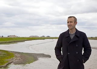
It’s a good, positive review not least because it compares me favourably with Robert MacFarlane (that’s him above).  He’s described as “a tad over-wrought” – whereas I am “down to earth and certainly funnier.”

Where the review goes off the rails:  “The book (mine) is kicked off by his (i.e. me) going out for a walk, not in some far-off wilderness but in the ordinary streets around Hollywood, where he falls and ignominiously breaks his leg.”

Fall - yes, ignominious – certainly, but guys – it was my arm not my leg.  Bit of a difference, and it is on the third page of the book.

Still, the review, and indeed the website, is to be found here:


http://beta2.walkingworld.com/Articles/Newsletter/Newsletter-archive/June-2012.aspx 

Saturday, June 23, 2012

SOMEWHAT LIKE A WHALE


As regular, or even irregular, readers will know, and not only from my previous post, I still have quite an affection for the old Volkswagen Beetle, and at this point in history that may be part of my ongoing affection for many dying (though not quite dead) forms: the printed map, vinyl, the novel, unshaven pudenda.

When I came to live in Los Angeles – about a decade ago now – there were still a lot of Beetles on the street, more than you ever saw in London, and way more than you saw in New York, the places I lived immediately before coming here.  It had a lot to do with the bad winters in those places, I’m sure.


And so when I arrived here, determined not to be part of the clichĂ© that nobody walks in LA, I’d go walking, if not exactly randomly then certainly without much purpose, just looking at things, and I’d make a note of how many VW Beetles I saw.  Sometimes I even photographed them.  And when I got home I’d think, “OK, today’s was a 3 Beetle walk.  Yesterday’s was a 5 Beetle walk” and so on.   Unsophisticated stuff I know:  Walter Benjamin would have been saddened.


The number of Beetles in LA has declined significantly in the last decade, though there are still a surprising number, especially given that (unless they’re imported from Mexico) even the most recent of them is a over 30 years old.  I’ve always been most fascinated by the ones that have the most patina, that show the most signs of wear, age and ruin, but the truth is, I no longer look at (or for) Beetles quite as obsessively as I once did when out walking.

Last week my pal Anthony Miller and I went for a walk in the wild east part of LA’s downtown and although we weren’t strictly in search of Beetles, we came across rather more than we expected.  We stated at Sci Arc (that’s the Southern California Institute of Architecture), a college housed inside a quarter-mile long former freight depot, a building big enough that you do plenty of walking while you’re inside it, especially if you’re there looking for an exhibition and are too guyish to ask anybody for directions.


The exhibition sounded intriguingly inscrutable, and its title was “Ball-Nogues Studio: Yevrus 1, Negative Impression.”  The description read as follows:

        “Constructed from non-architectural artifacts, Yevrus 1, Negative Impression is a disposable architecture of literal references that calls into question the contemporary architectural vogue for digital complexity and abstraction. The cast impressions of 1973 Volkswagen Beetles and speedboats unite to form a strong structural whole that serves as a lookout tower in the SCI-Arc Gallery.
        "After studying a variety of objects within the Los Angeles suburban-scape, the designers selected the individual components for their iconic and structural potential, as well as their availability. Once chosen, the parts were digitally scanned in three dimensions and cast in biodegradable paper pulp using a proprietary technique the studio refers to as a "Yevrus"—the word "Survey" spelled backwards. With this work, the first in a series of experimental Yevrus projects, Ball-Nogues rethinks the purpose of the site survey. No longer seen as a simple tool for construction and engineering, the survey becomes an instrument for finding form, seeking structural stability and realizing iconic meaning.”

I’ll forgive you if you didn’t read all the way to the end of that, but there was a very cool image (below) that advertised the exhibition.  I imagined that the thing in the picture had actually been built as a life-size set, so that we could walk into it and around it, like a kind of Ed Kienholz art installation.


As we walked across the vast sea of parking lot that surrounds Sci Arc I couldn’t help noticing a glistening silver Beetle over across the other side.  It operated as a beacon.


And when we got up to it, we saw it wasn’t just painted silver, it was actually wrapped in some kind of silver foil, in order that (we concluded) a mold or several molds could be made, without sticking to the car itself.  That’s one of the molds sitting next to the Beetle, on the right.


 Encouraged, in we went, walked around in an aimless way for a while, and eventually stopped being guyish and asked directions from a man who looked a lot like an architect (black roll neck, spiky grey hair, ornate specs and a German accent) and so we found our way to the exhibition space.  And that’s when we discovered that thing in the picture was actually just a picture.  There was no walk-in Ed Kienholz-style set.  Were we disappointed?  Yes, but we cheered up at the site of the pod in very middle of the space.


Now, that pod, as perhaps you can see, is partly made of casts taken from a VW Beetle, the one outside presumably, colored some very interesting shades, assembled, and lit internally by fluorescent tubes.  It was by no means what we came for, or had expected, but there was no denying it was kind of cool.


So then, afterwards, when we went walking “properly,” we saw this very clean convertible on the street:


And there was this one apparently being used as part of a photoshoot: 


Looking for Beetles was not the main purpose, or even the highlight, of our afternoon, but somehow our perambulation had become a kind of Beetle walk.  Not one of the great ones; essentially just a 3 Beetle walk, unless you counted the casts, and I think it was probably best not to.


And above is a photograph of my fellow walker, Anthony Miller, looking Jonah-like, as if he's inside the whale, if there had been fluorescent tubes in there, and if the whale had been shaped like a Volkswagen.  Very little room to walk in there.